“The adoption funnel view from Metrics Visualization Studio replaced three conflicting Excel packs we used for the Petaling Jaya steering group.”
DataSignal Tools
Charts that explain transformation — not decorate it.
We teach product, ops, and strategy teams how to design visualization layers that track digital initiatives without drowning decision-makers in vanity metrics.
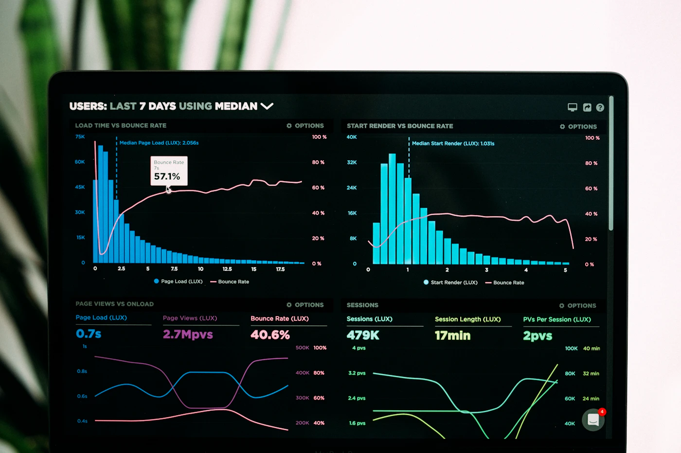
182
learners across KL, Penang, and Johor cohorts since 2023
7.8 / 10
average usefulness score after the Metrics Visualization Studio
41 days
median time for alumni teams to ship a first transformation scorecard
What you practice
From raw initiative logs to a readable signal layer
Programs focus on the awkward middle of digital transformation reporting — when tools exist but leadership still cannot see progress.
01
Baseline honesty before chart beauty
Learn to define what “before” looked like so every sparkline has a defensible starting point, not a decorative zero.
02
Metric families that stay stable
Group adoption, reliability, and outcome measures so dashboards survive vendor swaps and reorgs.
03
Narrative packs for steering meetings
Turn weekly exports into short visual stories that Malaysian stakeholders can discuss without a separate slide rebuild.
Featured learning
Programs built around real reporting pressure
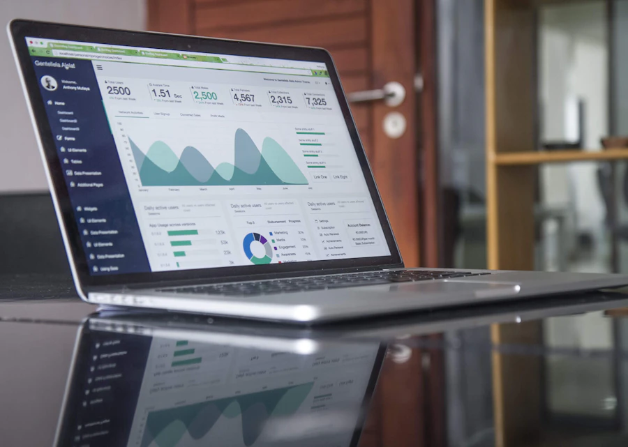
Metrics Visualization Studio
Flagship path for building a transformation scorecard your executives will actually open.

Signal Hygiene for Analysts
Short clinic on cleaning initiative data before it reaches a dashboard.

Board Pack Visual Language
Design patterns for quarterly packs that keep metrics comparable year over year.
From the field
Learners who left with fewer charts — and clearer answers
We ask alumni to name the module that changed their weekly ritual. The notes below are lightly edited for length.
“Useful, though the SQL clinic assumes you already know joins. Once past that, the reliability strip saved our Friday prep.”
Bring a messy metric set. Leave with a signal map.
Tell us which transformation initiative is hardest to report. We reply within two business days.